Imagine opening your inbox and instantly clicking on an email that catches your eye. Was it the subject line? Maybe. But more often than not, it’s the colors and the call-to-action (CTA) button inside that guide your next move. In the UAE’s fast-paced digital landscape, brands are constantly searching for ways to make their emails stand out and drive real engagement. Yet, many overlook a powerful ingredient, The psychology of color and CTA design.
Traditional email marketing tactics are no longer enough. Customers are savvy, selective, and overwhelmed by daily promotional messages. But there’s good news: Small design changes, especially color and CTA optimization, can lead to big results. In this blog, we’ll reveal how to use color psychology to your advantage, the science behind effective CTA buttons, and how SeamlessSend empowers businesses in the UAE, GCC, and worldwide to create high-performing campaigns.
The Problem: Why Traditional Email Design Fails to Convert
Let’s face it, most emails in our inbox look the same. They blend in with muted colors, generic buttons, and uninspired layouts. Here are the common challenges UAE marketers face:
Low Open and Click Rates: Research shows that average email open rates in the UAE hover around 21%–24% (source: Mailchimp, 2024). But click-through rates are often under 3%. Why? The message doesn’t “pop.”
Visual Overload: With more than 333 billion emails sent daily worldwide, your audience receives dozens of messages competing for attention. (source: Statista)
Weak CTA Placement: CTAs are often hidden, poorly colored, or lack urgency, leading to lost conversions.
Cultural Blind Spots: Colors carry different meanings across cultures. What works in New York may not work in Dubai or Riyadh.
Traditional email marketing often fails to create an emotional response, and emotion drives action.
The Power of Color Psychology in Email Marketing
Color isn’t just decoration. It’s a direct line to the human brain. Psychologists have long known that colors affect feelings and behavior:
Red: Creates urgency and excitement. Used for limited-time offers.
Blue: Communicates trust and reliability. Ideal for banks, hospitals, and B2B brands.
Green: Signals growth, wealth, or eco-friendliness. Great for finance and sustainability.
Orange: Friendly and energetic. Drives quick action.
Yellow: Optimism and cheerfulness, but too much can strain the eyes.
Black: Luxury, exclusivity, and sophistication, often seen in premium brands.
White: Clean, simple, and professional. Ensures your message doesn’t feel cluttered.
Fact: According to a study by Kissmetrics, up to 85% of consumers say color is a primary reason for choosing a product.
How Color Affects Email Performance
Brand Recognition: Consistent color usage increases brand recognition by up to 80% (source: University of Loyola, Maryland).
Mood & Trust: 42% of customers base their opinion of a brand on color alone (source: ResearchGate, 2023).
Click Behavior: A brightly colored CTA button (contrasting with the email background) can increase conversion rates by over 30%. (source: Unbounce)
Local Insight: In the UAE and GCC, gold, green, and blue often represent trust, prosperity, and growth, align your palette accordingly.
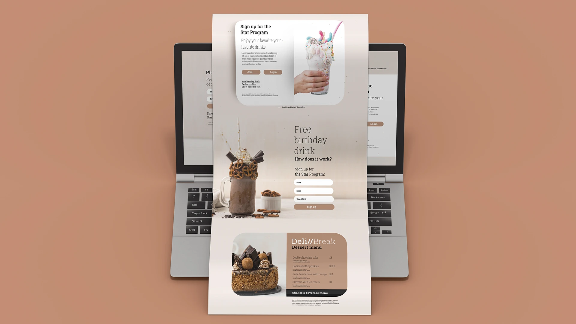
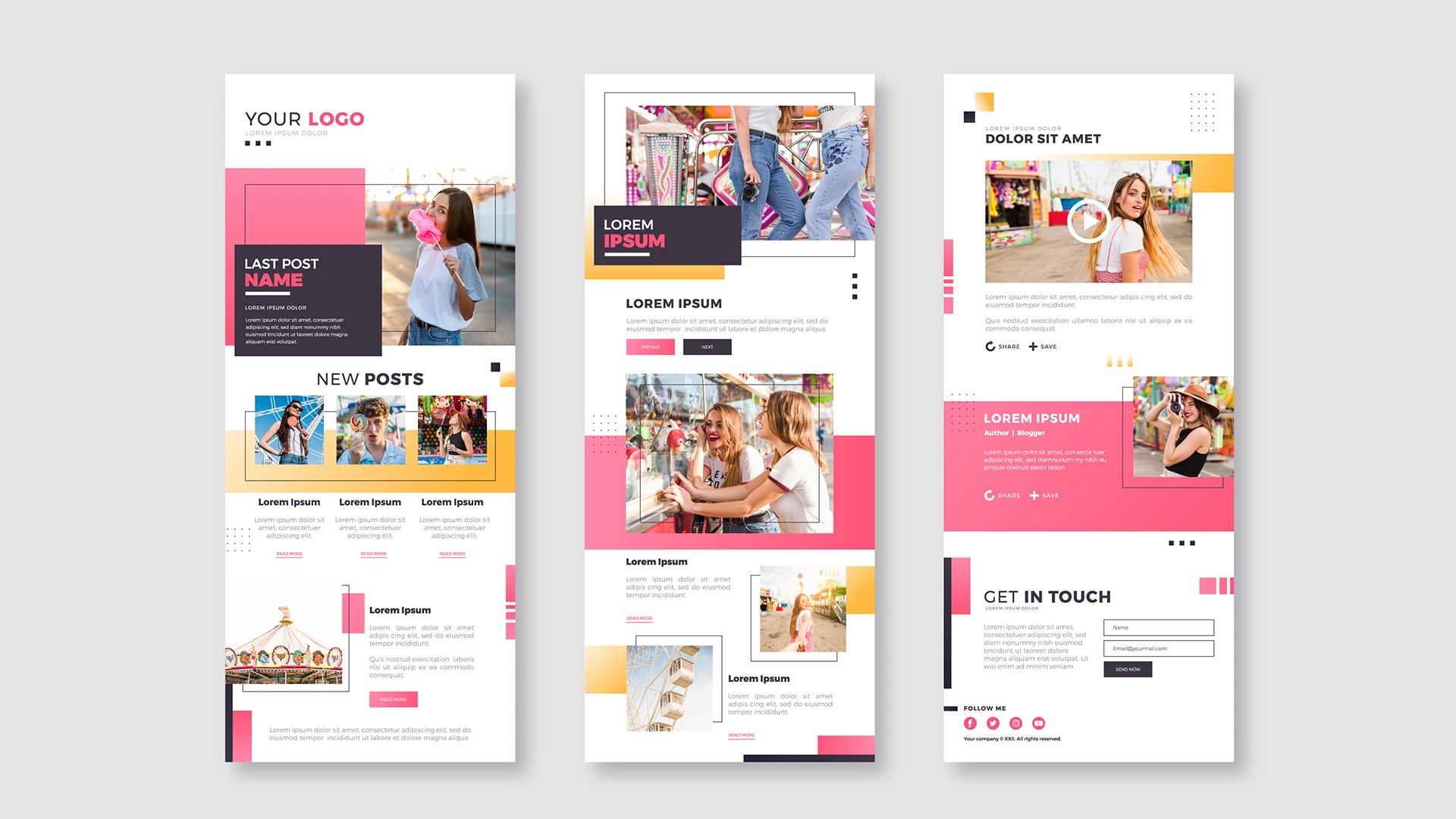
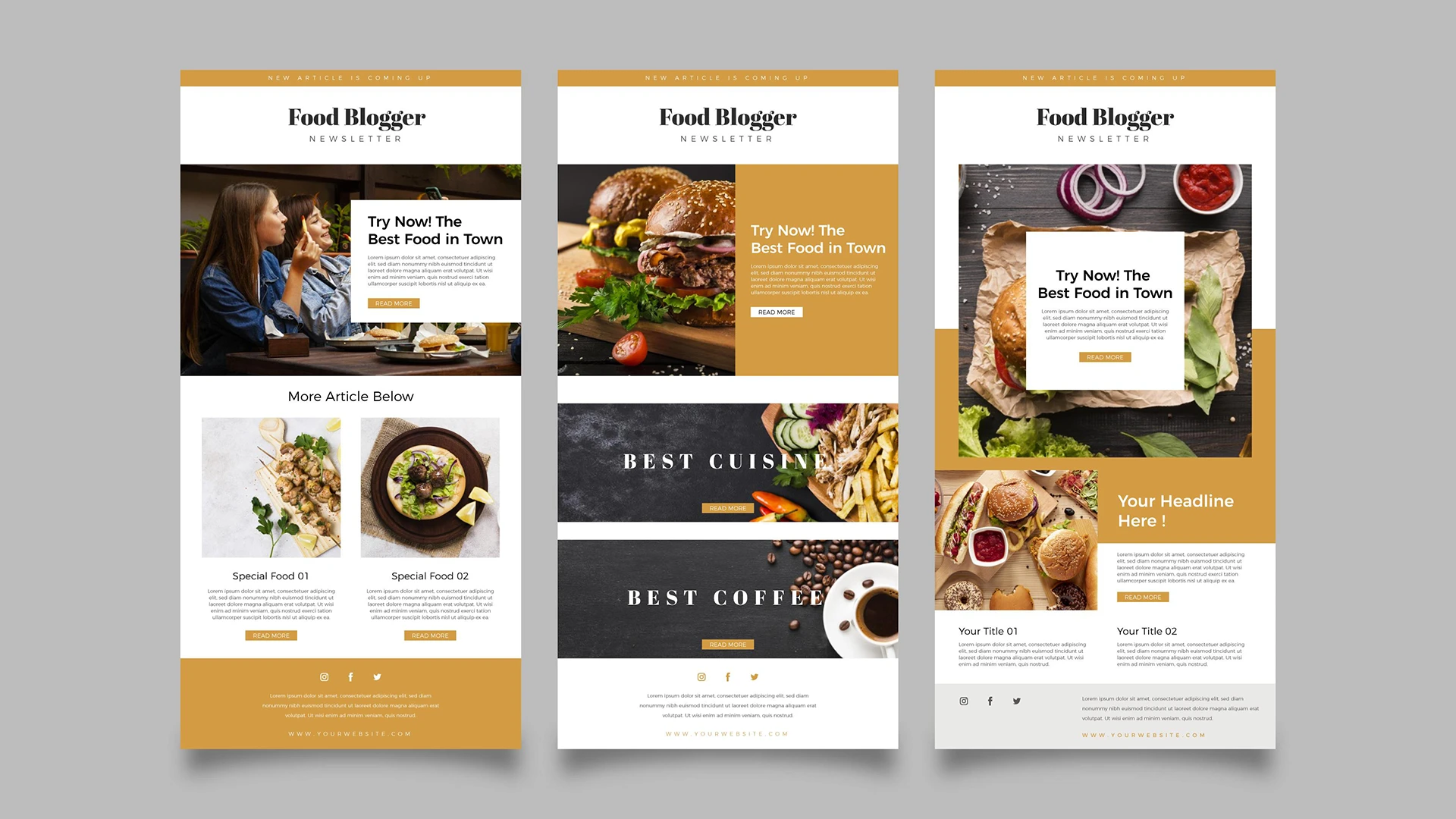
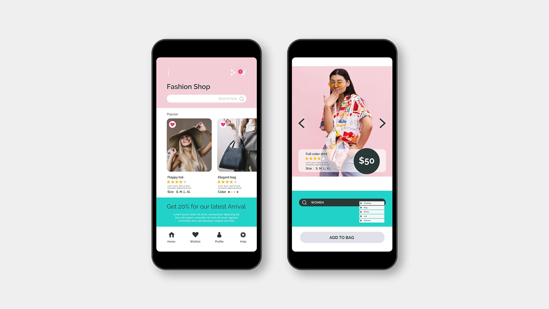
Call-to-Action Buttons: The Unsung Hero of Email Marketing
Your CTA button is your deal closer. But too often, it’s an afterthought. Let’s explore how to design CTAs that get results:
1. Color Contrast is King
Make your CTA button a different, bold color from your email background.
Example: If your email background is white, try a deep blue or green button for strong visual impact.
2. Size and Shape Matter
Bigger isn’t always better, your button should be prominent but not overpowering.
Rounded corners often feel more inviting and clickable than sharp edges.
3. Clear, Action-Oriented Text
Use short, actionable phrases: “Shop Now,” “Book a Demo,” “Claim Your Offer.”
Avoid vague words like “Submit.”
4. Strategic Placement
The top third of your email (above the fold) is prime real estate.
Secondary CTAs can go lower for users who scroll.
5. Urgency and Exclusivity
Words like “Today Only,” “Limited Seats,” or “Exclusive for UAE Customers” can boost clicks.
Real-World Examples: Email Color and CTA Success
Case Study 1: Dubai E-Commerce Brand
A Dubai-based fashion retailer switched their main CTA button color from grey to a bold red with white text. The result? A 26% increase in click-through rate within the first month. They also localized their color palette, using gold and blue accents for Eid campaigns, leading to higher engagement from UAE shoppers.
Case Study 2: Financial Services in Abu Dhabi
An Abu Dhabi financial company used blue and green hues in their email design, aligning with local trust signals. Their “Apply Now” CTA, placed above the fold and colored in contrasting orange, saw a 32% jump in form submissions.
Case Study 3: Sharjah Tech Startup
A Sharjah-based SaaS brand experimented with different CTA texts and colors using SeamlessSend’s built-in A/B testing. They found that a green “Start Free Trial” button outperformed a blue one by 18%, especially with new subscribers.
Solutions: How to Optimize Your Email Colors and CTAs
1. Choose Colors with Purpose
Think about the emotion you want your readers to feel.
For urgency, use red or orange. For trust, use blue or green.
Use local color preferences when targeting UAE and GCC audiences.
2. Test, Test, Test
Use A/B testing (available in SeamlessSend) to compare different color buttons and placements.
Monitor metrics: open rates, clicks, and conversions.
3. Make CTAs Stand Out
Ensure your main CTA button is the most prominent element in your email.
Use white space around your button for focus.
4. Be Consistent with Branding
Stick to your brand colors, but use accent colors for CTAs.
Too many colors can dilute your message.
5. Mobile-First Design
Over 60% of email opens in the UAE are on mobile devices (Litmus, 2024).
Make sure buttons are large enough to tap easily and have clear spacing.
6. Accessibility Matters
Use sufficient color contrast for readability.
Add descriptive alt text to buttons for visually impaired users.
SeamlessSend: Making Professional Email Design Effortless
You don’t need to be a designer to get colors and CTAs right. With SeamlessSend, you get:
Easy-to-use drag-and-drop editor: Choose from proven color palettes tailored for the UAE and GCC.
A/B Testing: Instantly test and optimize your CTA buttons for the highest conversion.
Built-in templates: Mobile-ready and fully customizable.
Expert support: Local expertise from Ci CORP Digital Marketing.
SeamlessSend takes the guesswork out of design so you can focus on results, no coding or design skills needed.
Actionable Tips: Boost Your Email Marketing Today
Ready to see real improvements in your next campaign? Try these steps:
Audit your last 3 emails. Are your CTA buttons visible, clear, and compelling?
Experiment with one new color for your CTA and measure the results.
Localize your color choices for UAE or GCC holidays and events.
Use SeamlessSend’s analytics to identify which colors and CTAs work best with your audience.
Conclusion & SeamlessSend Call-to-Action
The science of color psychology and CTA button design is more than just theory, it’s a practical way to win more attention, clicks, and conversions in today’s crowded inbox. As you’ve seen, small changes in design can make a big difference, especially for businesses in the UAE and GCC where local preferences matter.
Ready to take your email marketing to the next level? Visit SeamlessSend’s service page to see how you can design smarter, send better, and grow faster. Our team at Ci CORP Digital Marketing is here to support you, every step of the way. Share this blog with your team or on LinkedIn, and start your journey towards higher conversions, one email at a time.
Summary of Key Points:
Color psychology influences email engagement and conversions.
Effective CTA buttons are clear, bold, and action-oriented.
Localization and testing are crucial for the UAE and GCC market.
SeamlessSend provides the tools you need for high-impact campaigns.